By Joobin Bekhrad The New York Times Company
It began life as a tiny emblem, something to adorn a 45 rpm single or the band’s letterhead. It quickly became ubiquitous and, ultimately, the most famous logo in rock-and-roll.
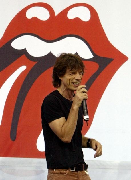
For more than 50 years, the legendary “tongue and lips” of the Rolling Stones has been emblazoned on everything from T-shirts and lighters to stage sets, appearing in countless variations throughout the decades. And although many who love it are fans of the band, the logo has in many ways transcended the Stones. But when it was commissioned in April 1970, its designer, John Pasche, had little idea how popular — and lucrative — it would become.
The logo was to be displayed later this month in “Revolutions: Records and Rebels 1966-1970,” an exhibition at the Grande Halle de la Villette in Paris that has been postponed because of the coronavirus outbreak. But Pasche, 74, spoke by phone from London last week, and he provided a glimpse into its backstory.
Early in 1970, the Royal College of Art in London was contacted by the Rolling Stones’ head office. The band was looking for an artist to create a poster for its 1970 European tour. The art school recommended Pasche, a Master of Arts student in his final year.
Pasche met with Mick Jagger to discuss ideas for the poster and returned to the frontman with a design a week later. Jagger was not satisfied. “I think it was possibly to do with the color and composition,” Pasche told the Victoria and Albert Museum in 2016.
“He turned it down,” Pasche recalled with a laugh. “I thought, ‘That was that, then.’” But Jagger said, ”‘I’m sure you can do better, John.’”
The second and final version, which harked back to the aesthetics of the 1930s and ’40s but also included a Concorde turbojet, was more pleasing. Pasche was contacted shortly after by Jo Bergman, the band’s personal assistant. This time, in a letter dated April 29, 1970, Bergman specifically asked Pasche “to create a logo or symbol which may be used on note paper, as a programme cover and as a cover for the press book.”
In a meeting with the designer some months later, Jagger was more specific, Pasche recalled: He wanted “an image that could work on its own … like the Shell Petroleum logo. He wanted that kind of simplicity.”
During the same meeting, Jagger showed Pasche an illustration of the Hindu deity Kali, which Jagger had seen in a shop near his home and asked if he could borrow.
Jagger, according to Pasche, said he was “more interested in the Indian nature of it,” with Indian culture in Britain being quite trendy. But the designer was struck by Kali’s open mouth and protruding tongue. “I just immediately picked up on the tongue and mouth,” Pasche said.
Contrary to popular belief, the logo, originally created in black and white and used to create subsequent versions, was not — at least intentionally — intended to represent Jagger’s tongue and lips.
“I said, ‘Surely those were Mick Jagger’s lips!’” recalled Victoria Broackes, a senior curator at the Victoria & Albert Museum, who in 2008 bought the original logo design online from an auction house in Chicago on behalf of the museum. Pasche, she said, “looked rather nonplussed and said, ‘Well, maybe subliminally, but no.’”
Pasche contends his logo also was intended to be a protest symbol. “It’s the kind of thing kids do when they stick their tongue out at you,” he said. “That was the main reason I thought it would work well.”
The logo was executed quickly toward the end of 1970. The release of the band’s classic “Sticky Fingers” album in April 1971 marked the logo’s first public appearance. It was used on the back cover, on the label and, most prominently, on the insert. However, an alternate version of the logo was used for the U.S. release — “slightly modified by Craig Braun,” said Andrew Blauvelt, curator-at-large for design at the Museum of Arts and Design in Manhattan.
At the time, Braun was working with Andy Warhol to realize Warhol’s idea of a working zipper on the album’s cover. Pasche said that Braun modified the design not because it was lacking in any respect but because it had been faxed to the United States in a rush. The fax “was very grainy and gray” — and the logo, Pasche admitted, “needed redrawing.”
It is Braun’s elongated version, with extra lines and highlights, that continues to be used officially. In Pete Fornatale’s book “50 Licks: Myths and Stories from Half a Century of the Rolling Stones,” Braun said that he had been given Pasche’s logo by Marshall Chess, the president of Rolling Stones Records, and “basically outlined the highlights, the lips, and the tongue.”
(Braun and Warhol were nominated for a Grammy Award in 1972 for best recording package for “Sticky Fingers” but lost to Gene Brownell and Dean O. Torrence’s cover design for Pollution, depicting a chick in a gas mask emerging from its shell.)
And Pasche’s logo continues to be attributed to others. “A lot of people think Andy Warhol designed it,” Broackes said, “which of course he didn’t.” She believes Warhol’s mistaken association with it was because Warhol was credited for the rest of the artwork on “Sticky Fingers.”
Pasche said he was paid only 50 pounds in 1970 (about $970 today), and also received a 200-pound bonus. It was only in 1976, when an official contract was drawn up between himself and Musidor BV, the band’s Netherlands-based law firm, that the designer began receiving royalties for his work.
Pasche remembers his share as 10% of net income on sales of merchandising displaying the logo. He estimates he made “a few thousand pounds” in total in royalties until 1982, when he sold his copyright to the band for 26,000 pounds.
Pasche’s original design can today be seen at the Victoria & Albert Museum (which has historical ties to the Royal College of Art). Broackes said, “The fact that it was physically designed on the premises and came back to us was in itself a remarkable thing. It’s a star object in a sense for that, not just because it’s the most well-known logo.”